Welcome to the Logo section of my portfolio. Here you’ll find a selection of logos I’ve created over the recent years, each designed to capture the essence of a brand through symbolism and clean visuals. Every logo represents a challenge where I’ve applied my skills in composition, typography and conceptual design to create strong brand & product identities.
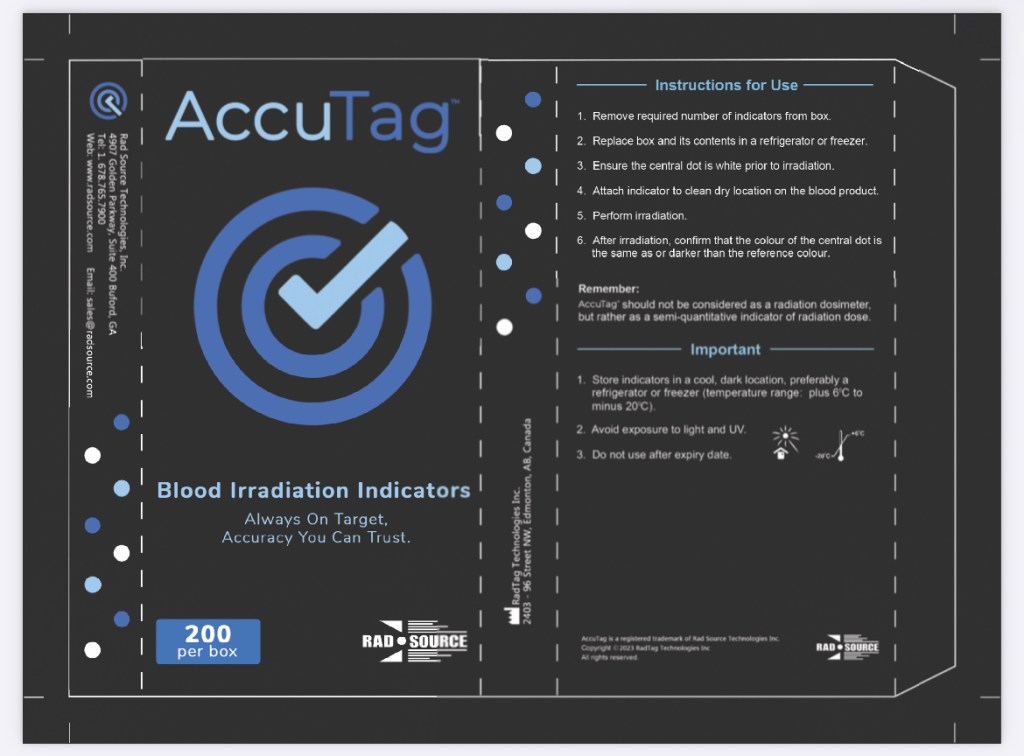
The AccuTag product name, logo, color scheme, tagline and packaging were all created by me in 2024. Essentially it’s a medical product with constantly accurate results. More specifically it is blood irradiation indicator tag kit.
Here is the blueprint of the product packaging I designed:
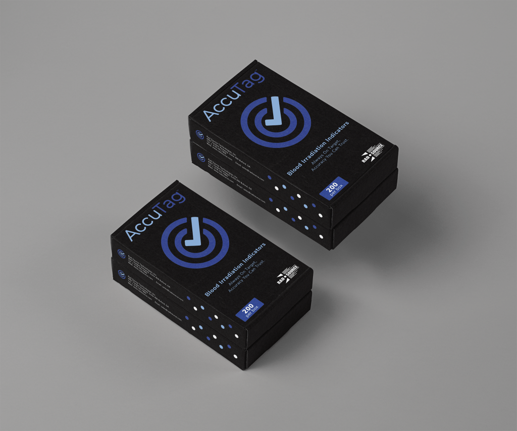
Here is the actual product packaging when printed and finalized:
– Published in Graphic Design USA May 2024 Edition –
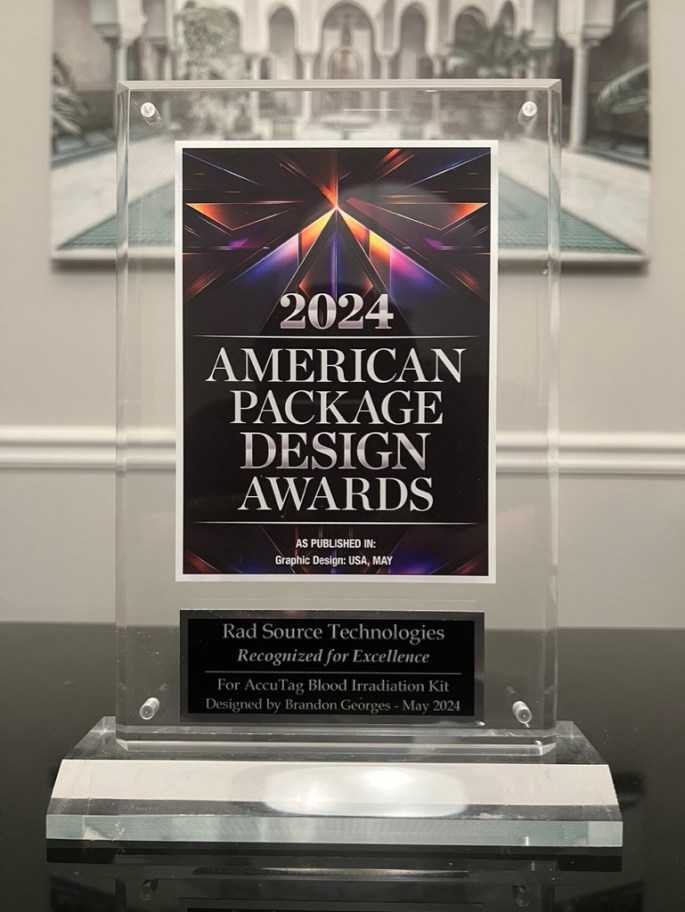
This product received a Graphic Design USA American Package Design Award and was published in their magazine. Above is the plaque I received in honor of the achievement.
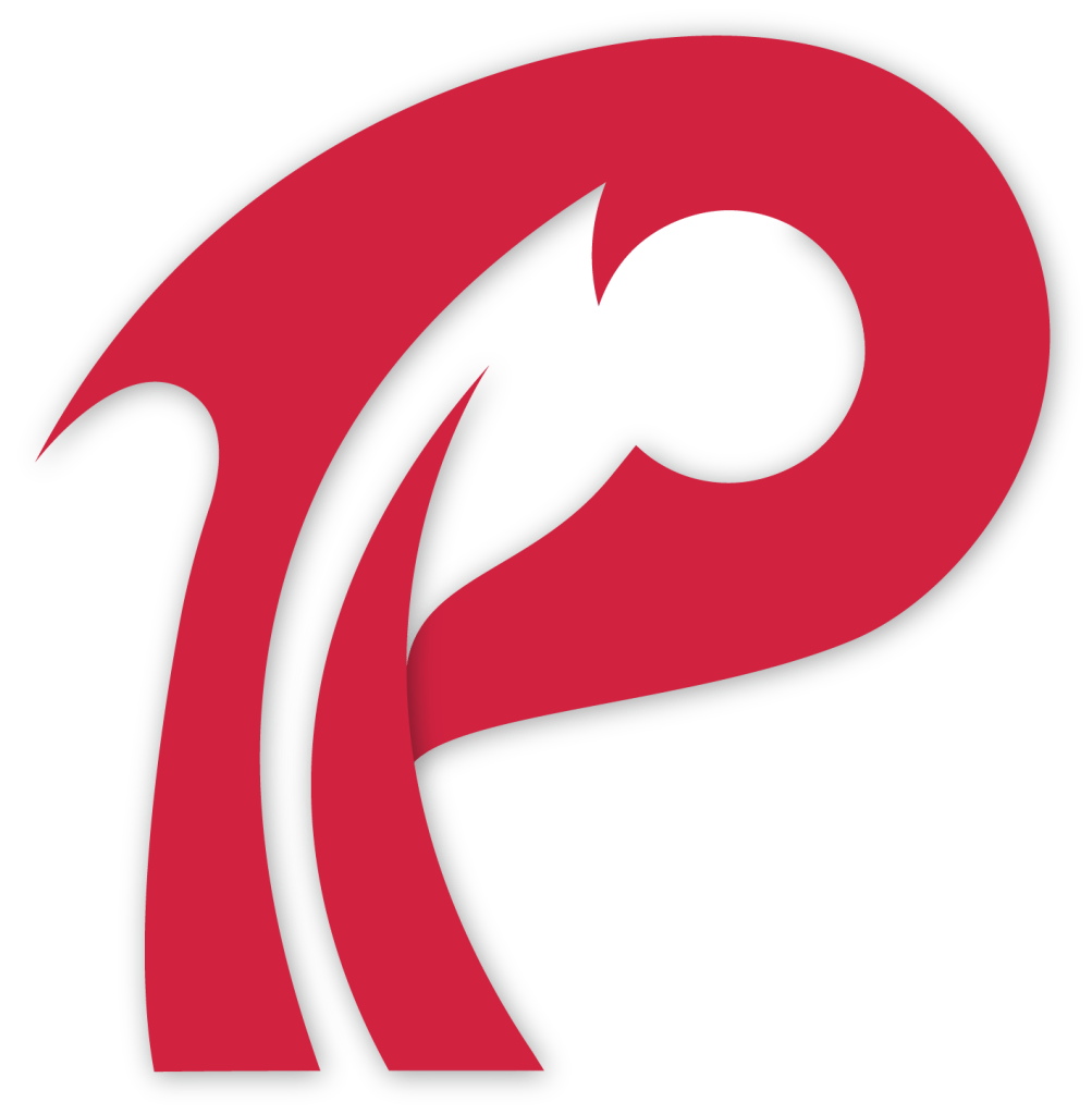
Designed as a logo for blood irradiation canisters, which is a medical grade product that serves as a protective container for donated blood while it gets irradiated with X-rays in order to remove any impurities or potential diseases.
I intended for this logo to embody blood irradiation with its deep red color, as well as the + sign inside of the O as a nod to O positive blood, which can go unnoticed at first glance.
Here is another form of the Phantom Logo I created for miscellaneous uses such as future products, t-shirts, signage, labels, marketing collateral, etc.
This is a logo I created for a sister brand of a prior employer of mine for their new venture in distributing pre-irradiated (sterile) insects. The design reflects the innovative approach of the brand, emphasizing sustainability and eco-friendliness.
By using modern aesthetics, my logo aims to attract environmentally conscious consumers and convey a sense of trust and responsibility in the entomology field.
I developed this logo concept while working as a contract graphic artist for Gaard Studios. It excelled at embodying the name and overall vibe of the country club.
Logo design for a new organic juice business opening soon.
Logo revamp for Benchmark Automotive Group in Virginia.
Created in 2025 for ATL Home Care Agency, a new business starting up in North Atlanta that aims to provide home care services and support for families.
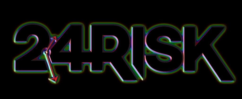
Designed for a start up clothing brand to represent taking a risk to achieve greater heights in life, 24 hours of the day. Using bold text and symbolism, I aimed to capture the belief that every moment is an opportunity to strive for success. What I like the most about this logo is its ambiguity. When shown to different people, some say they see 24 R, in reference to the name of the business, but others say they see 24HR in reference to 24 hours a day.
Alternate version for black backgrounds and bolder applications: